Thanks to Andy Warhol, tomato soup is no stranger to being in the limelight. Very much surpassing its five-minutes’ fame to become a true cultural icon. In 2022, the vibrant hue has gathered renewed momentum, being touted as the ‘it’ colour for interiors this season after a smattering of brands painted Milan Design Week, quite literally, red.
Traditionally the colour of passion, tomato red has been adopted in post-pandemic environments to evoke a sense of theatre and fun – creating a point of differentiation from what has been a mundane day-to-day for many. Playfulness is perhaps the biggest macro trend of 2022, and the red colour palette feeds into an overarching desire for interior spaces to offer experience and excitement.
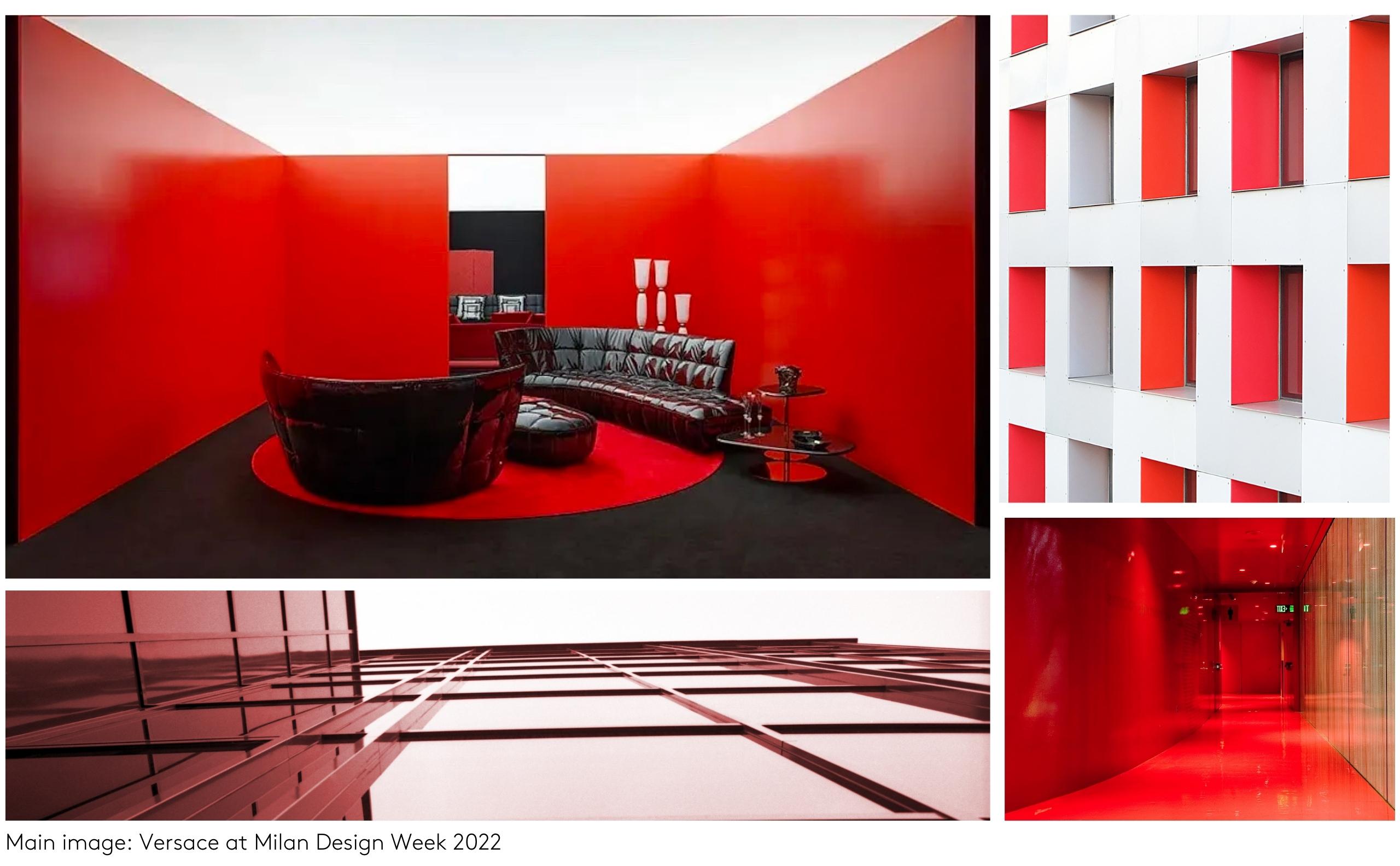
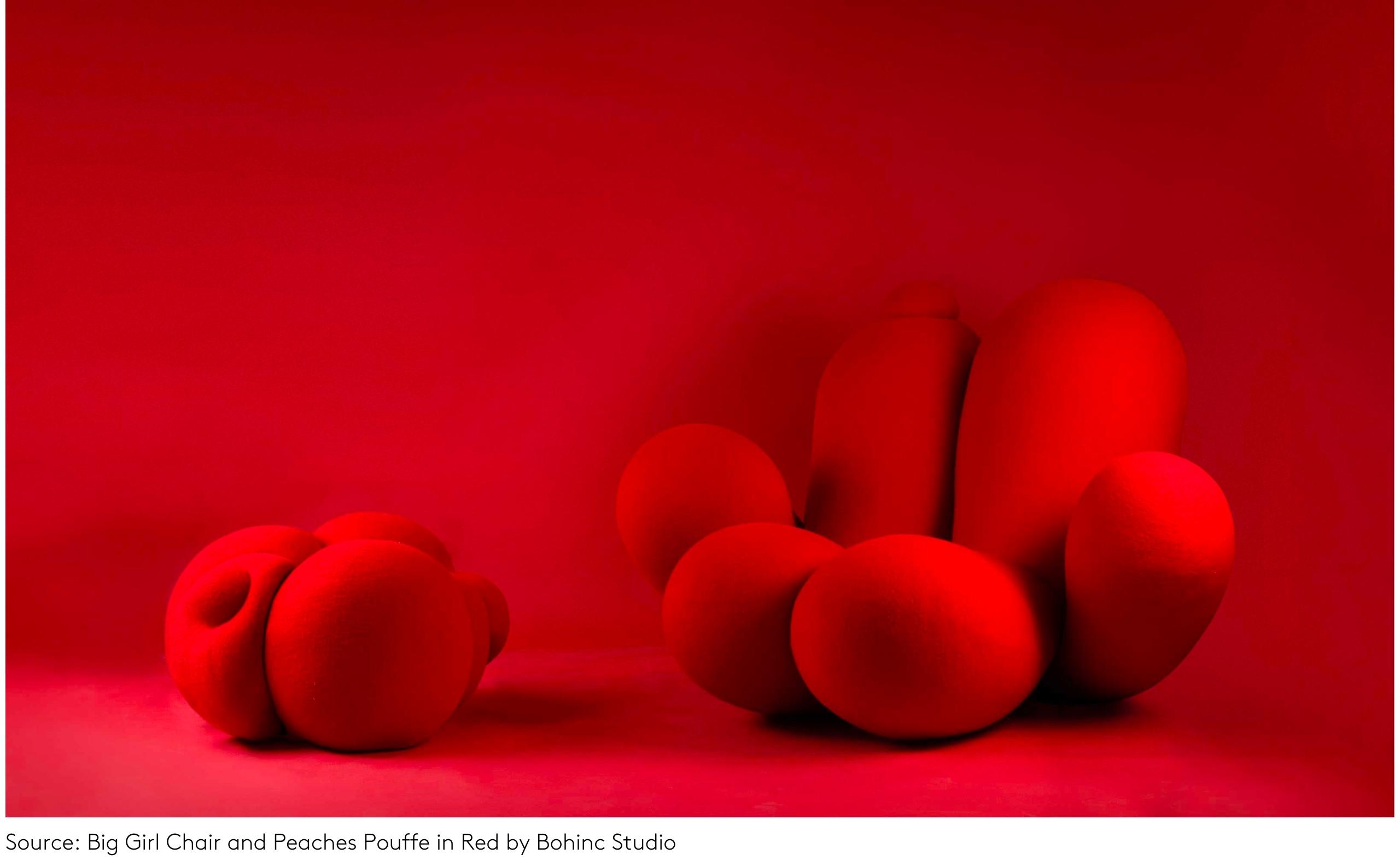
In Milan, red was paired with statement shape to produce confident, key pieces of design. Bohinc Studio combined it with chunky, cushioned curves for eye-drawing results. Similarly, British designer Paul Smith chose the shade for his furniture collection with DePadova, elevating classic styles with 2022’s colour of the moment. Taking a slightly different approach to curves was the Loop Lounge chair by India Mahdavi for Gebrüder Thonet Vienna, with a circular arm rest and cylindrical back in a selection of colours, including, of course, bright red.
When it comes to implementing a trend this bold in commercial projects, the prospect could feel slightly daunting. How does it fit in with the rest of your scheme? And what should it be paired with?
Why not use it to transform a washroom from just practical, to practical, and, playful? We’ve already highlighted the trend for ‘Instagrammable’ washrooms. And using a tomato red palette could be your client’s one way ticket to going viral, or at the very least, raising plenty of smiles in the process.
The beauty of designing a washroom is that it can either exist as a standalone scheme, or as part of the overall theme of a space.
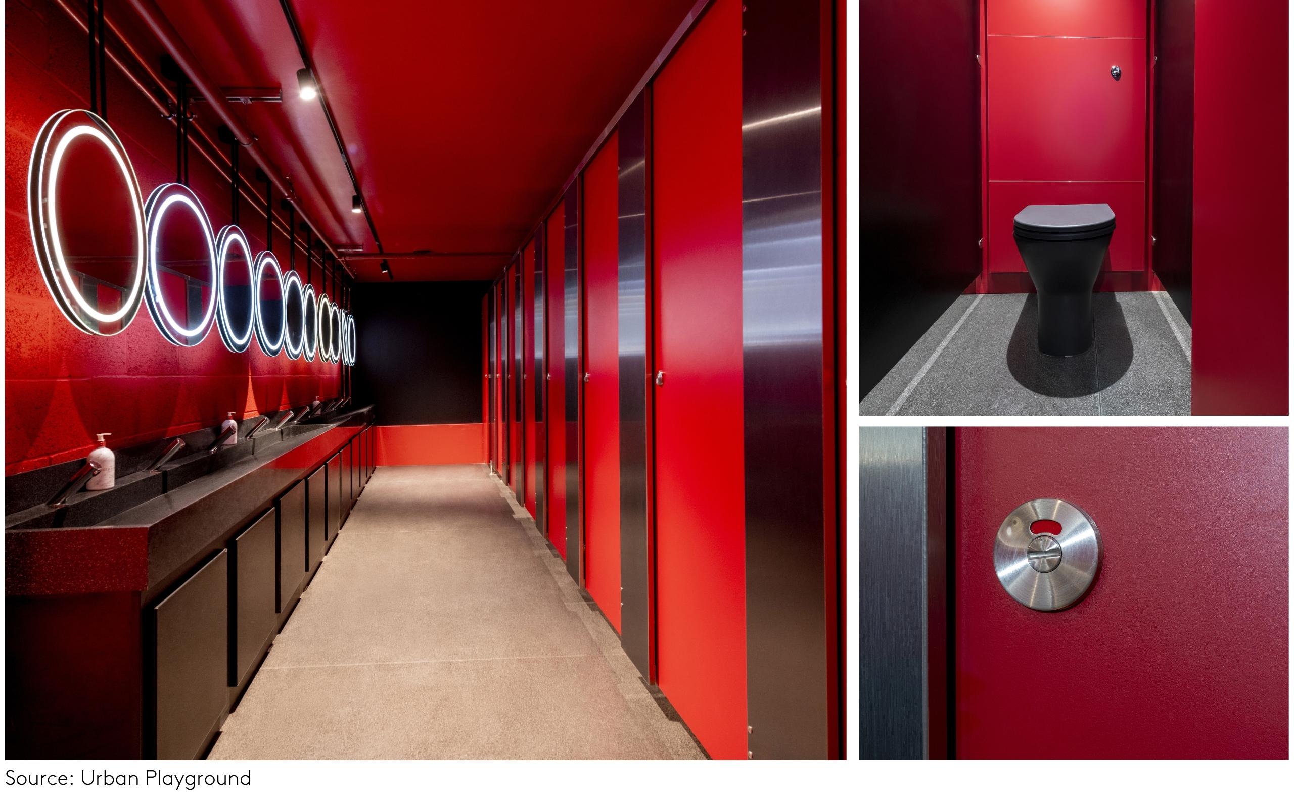
For our client Momentum Group’s Urban Playground development – a multi-million-pound entertainment venue in Manchester city centre – the washrooms were required to continue the vibrancy of the main interiors.
This resulted in a futuristic red and black combination for the cubicles, walls, vanity units, troughs, and toilets. Rich and varying textures also played an important role in creating dramatic effect, from woodgrain detailing to granite inspired. When it comes to adopting the tomato red trend in a washroom scheme, Urban Playground is a stand-out example in how to balance form with function.
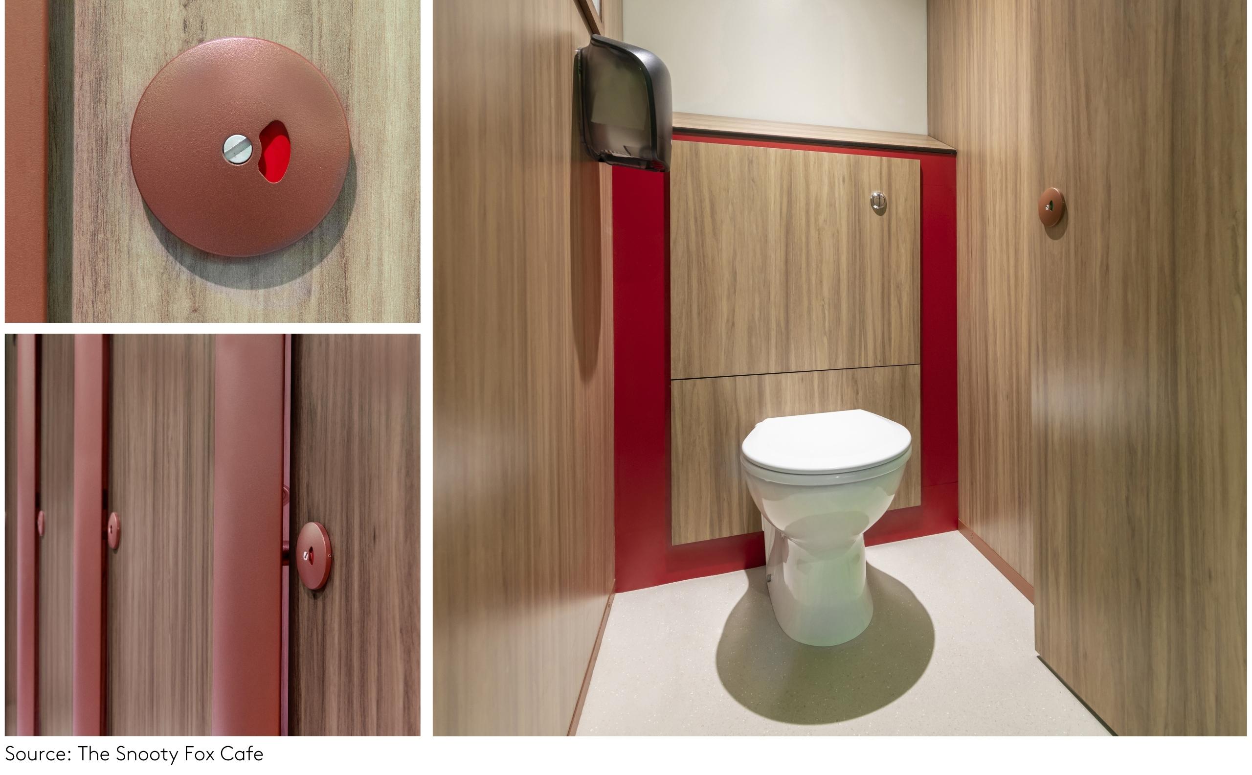
At the Snooty Fox in Guildford, red was also the colour of choice for the washrooms albeit in a more toned-down way.
Used as an accent against wood-effect laminate panelling for the cubicles and basin area, red shadow panels were set against more muted, red-brick pilasters and locks, working in conjunction to add a jolt of joyful expression without overshadowing the overall relaxed ambience.
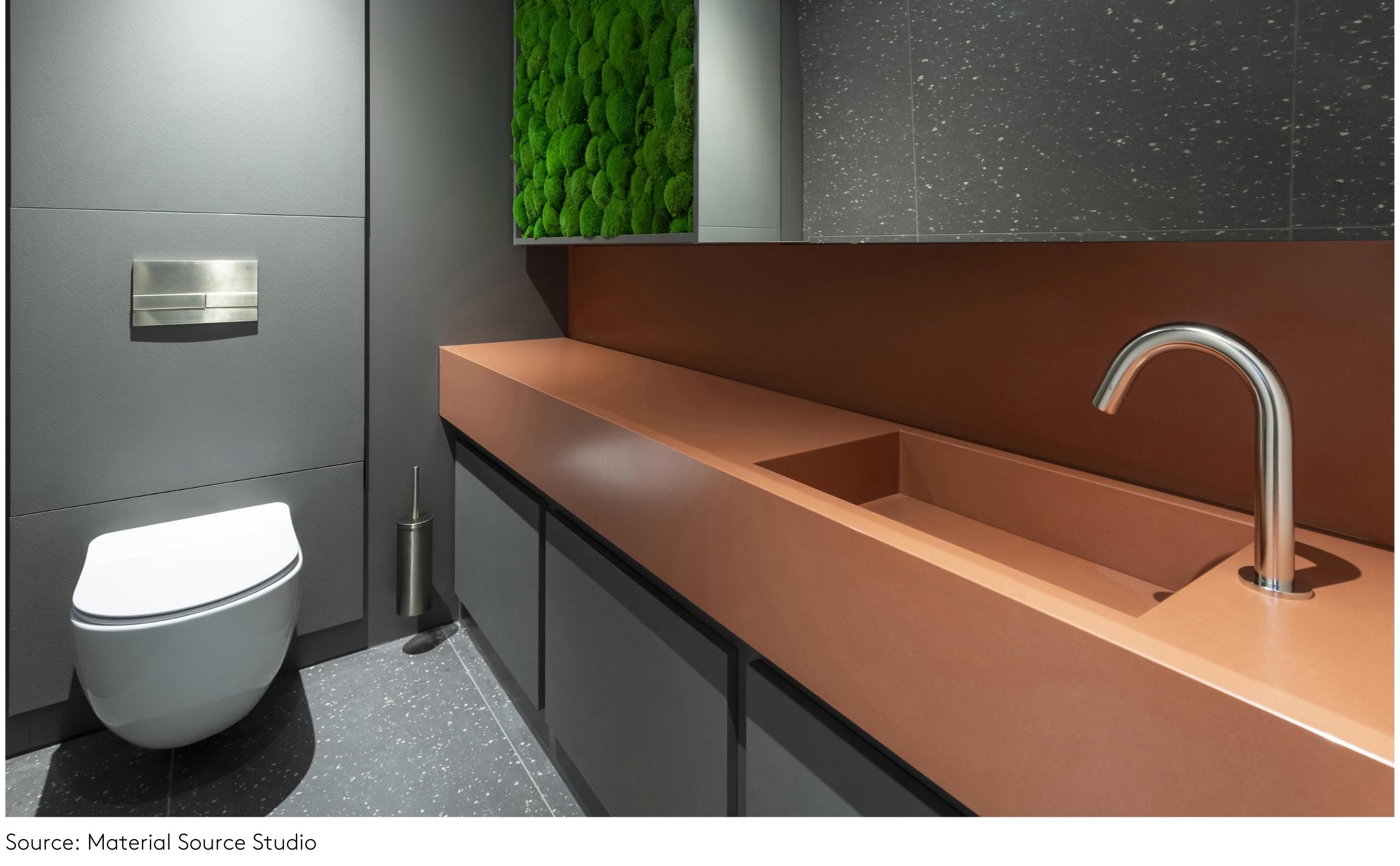
Again, taking on the trend in a slightly more pared back way are the downstairs Superloos at Manchester’s Material Source Studio. Featuring a vanity unit in Arcilla Red from our collaborative collection with Cosentino, a Mediterranean-inspired red works with the darker interior elements to provide a fun yet chic focal point.
Feeling inspired to take on tomato red? We can support you in designing a trend-led washroom scheme that works for you and your client. Get in touch with our team to discuss your project.

 Share
ShareUnion House, Unit 2A,
Altrincham Business Park,
Stuart Road, Altrincham, Manchester, WA14 5GJ


